Reducing an organization's customer support efforts by redesigning their website
- 2021
- Evozon
The context
I redesigned an organization's website, enabling the users to find information more easily and improving the organisation's visibility and communication with its members.
The organisation is a not-for-profit association that represents the interests of companies in the insurance industry before legislators. They organise events for members, publish various publications on industry-specific topics and promote fair development of the industry through advocacy.
Role, team and process
As the sole UX designer on the team, I was responsible for leading stakeholder discussion, discovery, research and design, while collaborating with crossfunctional team members.
From the client's side, I collaborated closely with the organization's CEO and customer support representative, who were my main points of contact.
My team consisted of a project manager, a UI designer, a QA and two Wordpress developers. I involved the developers in the process from the initial phases, asking for input from a technical standpoint. Later, I collaborated with our UI designer to ensure that the final designs were accessible and user-friendly.
The challenge
The initial project brief called for adding some new pages and functionalities, as well as improvements to the website's search function to make it easier for users to find content. However, upon analyzing the existing website and gaining valuable insights from both users and stakeholders, it became clear that a complete redesign was necessary.
How might we enable members and visitors to easily find the information they need, reducing customer support efforts on the organization's side?
How might we bring more visibility on the organisation's activity, to both members and interested parties?
These challenges were framed after the initial discovery and research, and helped guide the entire design process later on.
The result
An improved user experience for both the association's members and interested parties.
By improving the architecture, navigation, layout and user flows, I helped the organisation reduce its customer support efforts, and boost its visibility to members and the press.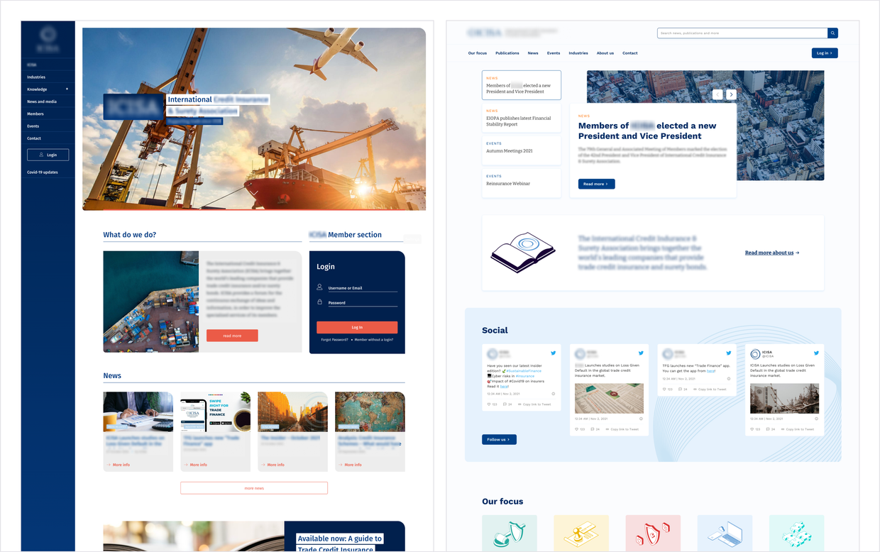
Improved architecture and navigation
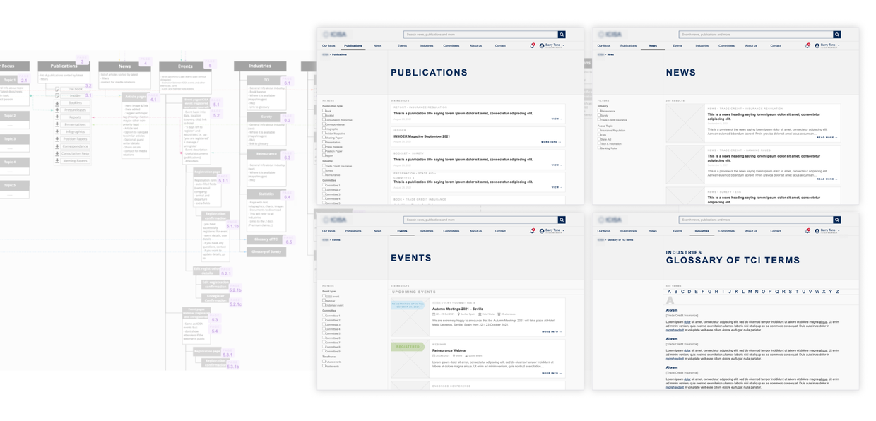
Improving the information architecture to make information easily discoverable and reduce support requests
The customer support team used to receive numerous requests from users who were unable to find specific documents or information, otherwise available on the website. By rethinking the information architecture, I made content more easily discoverable, which helped dramatically decrease support requests and reduce their workload.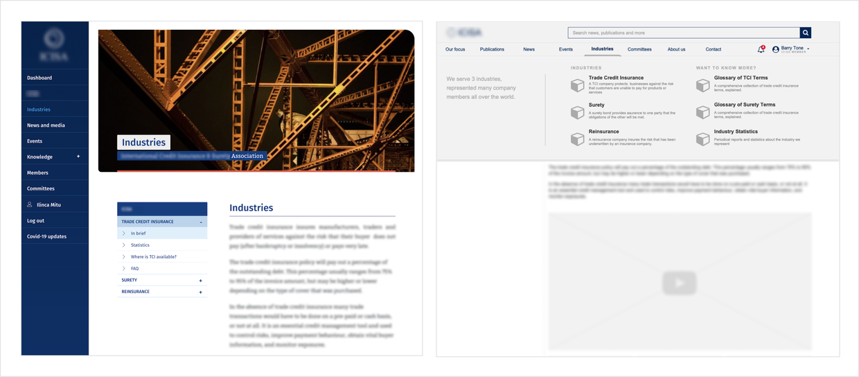
Rethinking the tagging system to eliminate duplicate content, reduce workload and improve website performance
Previously, the organization tried to help users find information and documents on the website by posting it in multiple places, which resulted in duplicate content and double work. By rethinking the tagging system, I enabled users to easily find related content. This also eliminated the need to post the same content in multiple places, reducing their workload, and ultimately improved the website performance.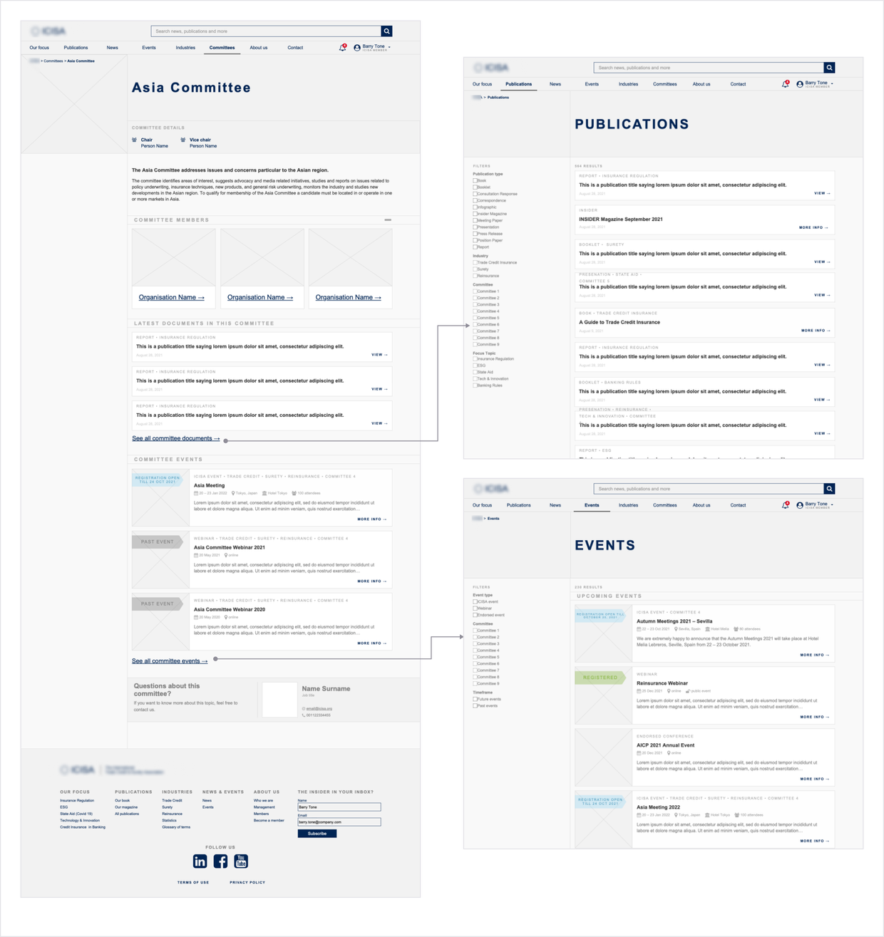
Easier management for events
Streamlining the event registration experience
One of the main tasks members did on the website was registering for the events organized by the association. However, to edit or cancel their registration, they had to contact the organisation. I designed new register, unregister and edit registration flows, helping reduce members' reliance on customer support and the team's workload.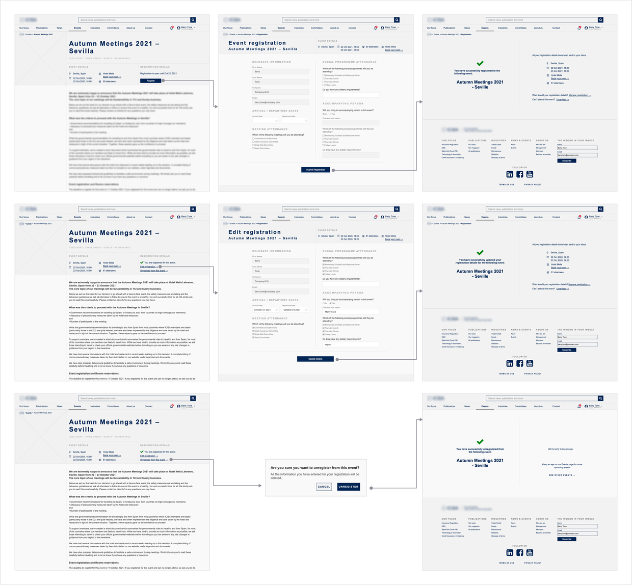
Imporved image and visibility
Improving the visibility of the organisation's activity by creating more engaging pages
Members were often unaware of the association's activity, because the old website failed to communicate it. The organization tried to address this issue with a user dashboard where members could subscribe to specific topics and receive emails when articles on the topic were posted. However, the dashboard had low usage, with less than 1% of members subscribing to a topic. I removed the unused dashboard and implemented notifications for members, and designed a more engaging homepage. These changes significantly enhanced the organization's visibility to both its members and the press.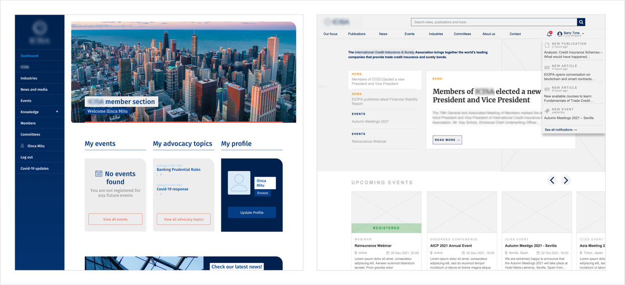
Accessibility
Improving accessibility through consistency, readability and clarity
As a UX designer, I focused on creating an accessible interface by minimizing cognitive load with clear and intuitive navigation, clear page hierarchy, and consistent, responsive layouts and components. Working closely with the UI designer, we prioritized designing an accessible typography system and ensuring sufficient contrast for optimal readability.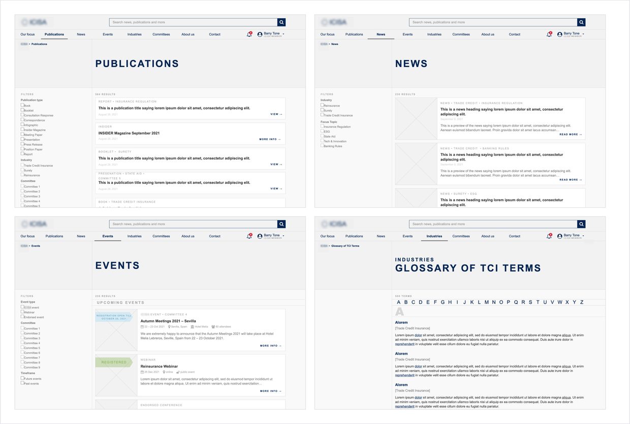
Getting there: discovery and research
To familiarize myself with both the business and user, I started with a discovery and research phase.
In this phase I collaborated closely with the stakeholders and did user reasearch, to identify business goals, user needs and pain points.
Stakeholder interviews
I conducted stakeholder interviews, during which I pinpointed the main users of the website and identified the main business goals for the project: reduce support request and improve visibility.
The websites was used, firstly, by their members, and secondly, by visitors, who were press representatives, industry regulators or researchers. Because neither members nor visitors could find information they needed on the website, they often contacted customer service to provide specific information or documents. Moreover, members were often unaware of the association's activity because the existing website failed to communicate it.
Existing user feedback
I analyzed customer support requests, which revealed a lot of user needs, as well as problems with the existing website.
Some of the main issues I discovered:
- members would often call or email the association to ask for a specific document, which they couldn't find on the website (even if it was there);
- members would often claim that they can't log into their accounts;
- press would call or emails to ask for opinions or responses to specific events in the industry (for example, a new law);
- press or regulators would ask for industry specific information, most often industry statistics or information about the association (for example, number of members)
- members who had registered for an on-site event would call to either unregister from the event or let the organisation know of some changes in their schedule (such as arrival or departure time).
These issues alone were a clear indication that the existing website didn't meet the needs of the users, so a full redesign would be necessary.
User research
I conducted remote interviews with two member-users. I gained valuable insights into their day-to-day jobs, as well as their needs and pain points.
Both interviewees revealed similar insights, regarding their experience with the website:
“I almost never go on the website. The association is very valuable to me, but I also have a day job and duties, I need something that I can consult quickly, maybe on the train to the office, and the website isn’t fit for purpose.”
During interviews with organization stakeholders, specifically their PR department, I gained valuable insights about the other tyoes of users, such as press and regulators. With the knowledge gained, I put together proto-personas, which were shared with the entire team and served us for the whole design process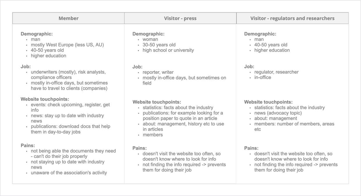
Going deeper: analyzing the why
The initial research provided me with valuable insights about the existing issues and users' needs. I started doing a more thorough analysis to uncover the root cause of these issues.
To do this, I did a complete analysis of the current website and looked for insights in Google Analytics. Throughout this phase, I collaborated closely with the association's stakeholders.
Google Analytics insights
Analytics reavealed that website enagement was very low, for both logged in and not logged in users.
Some key points:
- the only pages with traffic from members were events pages, meaning that the members only used the website to register for events;
- an average session on the website was less than 30 seconds, which seemed concerning since most content was long-form written content;
- visitors mostly arrived on article pages from social media links and exited the website from the same page, without any further interaction.
Analyzing the existing website
I started with a cognitive walkthorugh, to familiarize myself with the website and identify potential issues. I discovered many problems in the navigation, information architecture, page layouts, user flows and interactions.
Some examples of problems:
- wrong or non-existent breadcrumbs;
- missing page titles or page titles not corresponding to the navigation labels;
- many clicks required to download a document;
- faulty user flows, such as sign in and reactivate account.

I also noticed that some important content was buried deep within the website architecture, while some highly visible pages contained little to no important content.
This issue made it challenging for users to find the relevant information they needed, leading to frustration and decreased engagement with the website. Moreover, I found a lot of duplicated content and functionalities, as well as overlapping filters for published content. I also came across some unexpected behaviours. For instance, after logging in, the homepage was no longer visible and replaced by a dashboard. The search function was also hidden within one of the child pages - which, from analytics, was seldom visited.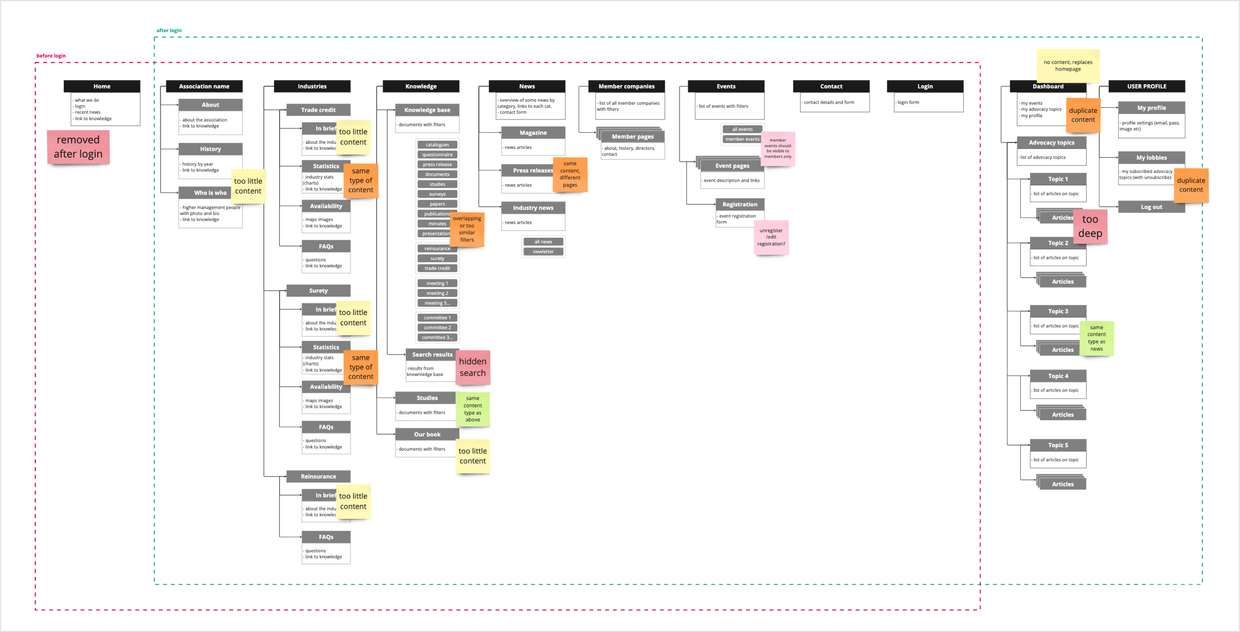
Fixing and defining
With the knowledge gained about existing problems, the business and the users, I started the redesign by handling high-level problems first.
I redesigned the information architecture of the website and the user flows, considering happy and unhappy paths.
Fixing information architecture
Considering the main user and business goals, I redesigned the information architecture to account for user's priorities and organize content in a more structured manner.
It took several iterations and feedback sessions from stakeholders to reach a IA variant which would serve both the business and the users. During this phase I focused on removing duplicate content and functionalities, grouping pages with little or similar content together, rethinking the order of pages by prioritizing, and bringing more visibility to pages which were important for both users and business. In this phase I also redesigned the tagging system for published documents - I added, removed, grouped or renamed tags to better suit the content and make it easier for users to find.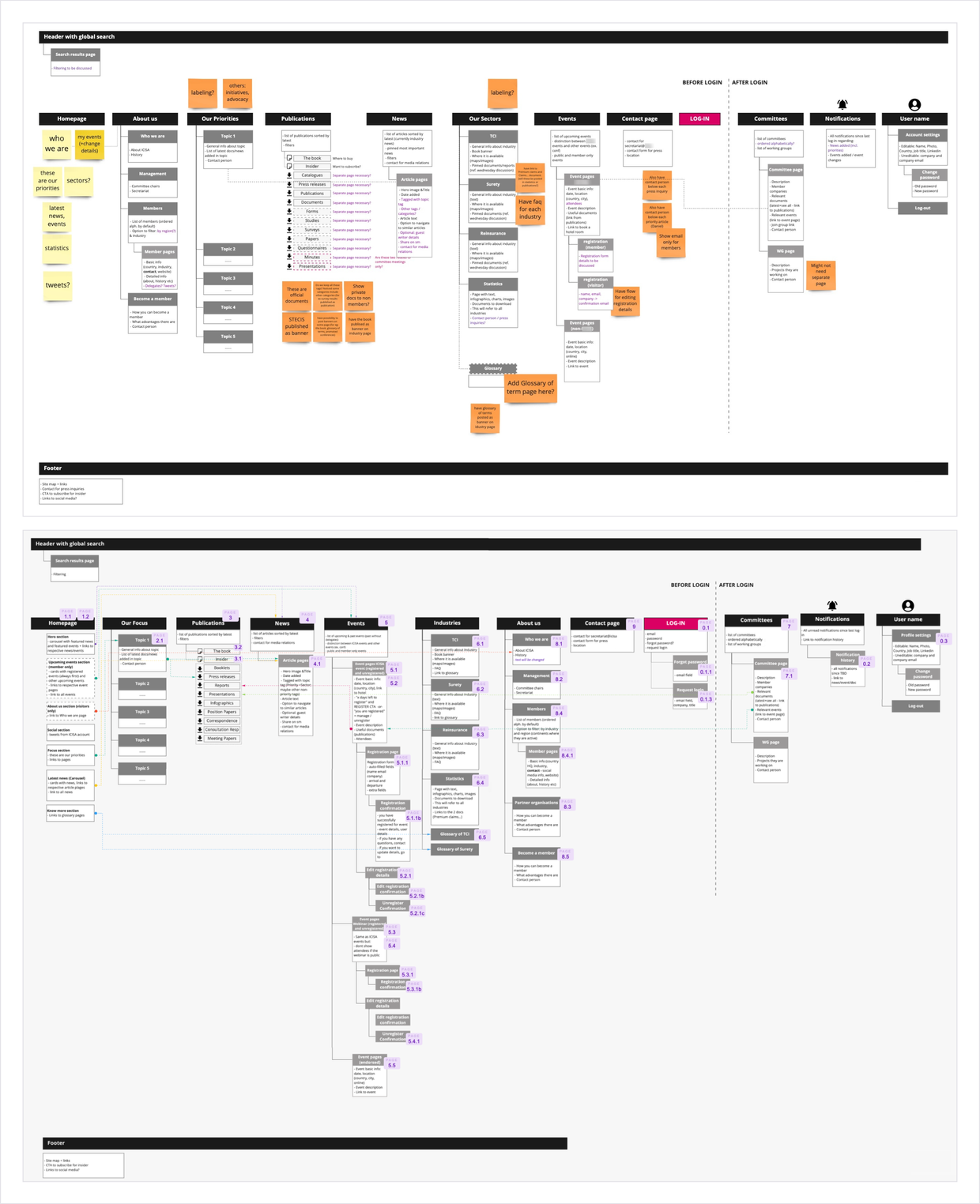
Fixing faulty user flows
Some faulty user flows were causing a lot of friction, so I went on to fixing them.
For example, account reactivation caused numerous support requests. For security reasons, users had to reactivate their accounts every 90 days by clicking on a link in an email. The email was sent just once (on the 90th day) and many users ignored it, causing to be locked out of their accounts. To address this, I redesigned the flow to automatically send a new email each time a login attempt was made on a deactivated account.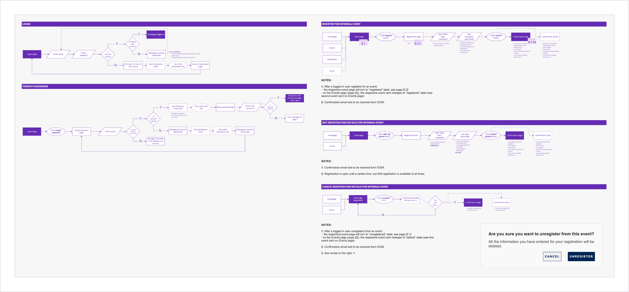
Design and iterations
With the content frames and flows approved by the team and stakeholders, I moved on to interaction design.
In this phase, I collaborated closely with the development team to identify potential technical constraints, as well as stakeholders to get feedback on the wireframes. Finally, I did usability testing to uncover potential flaws and improve the designs.
Navigation
Fixing the architecture allowed me improve the navigation.
The existing website design had a left-side navigation, with 11 top-tier items for logged in users (plus homepage). Additionally, each top-tier page had a secondary navigation, breaking page content into very small chunks. This took up a lot of horizontal space and required a lot of clicks to arrive to the desired content.
I iterated on several navigation types. A megamenu, a horizontal navigation with dropdown and a double nested navigation. Finally, I decided to do usability testing with the first two.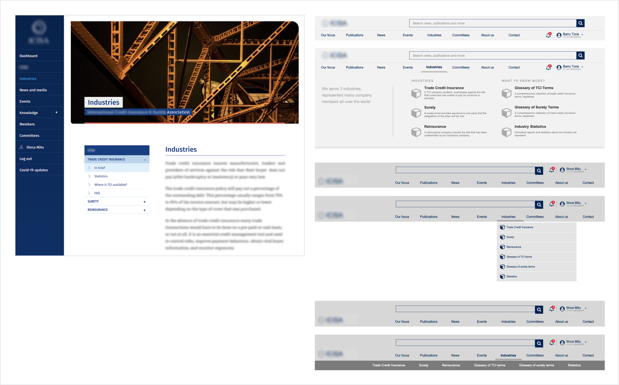
Page layout
Considering the navigation, filters and content type, I decided on the best page layout.
The general page layout was determined by two key factors. Firstly, removing the left-side navigation provided more horizontal space. Secondly, due to the high number of filters required for most pages, I opted to place them vertically on the side, rather than horizontally on top of the content, to ensure a more consistent layout.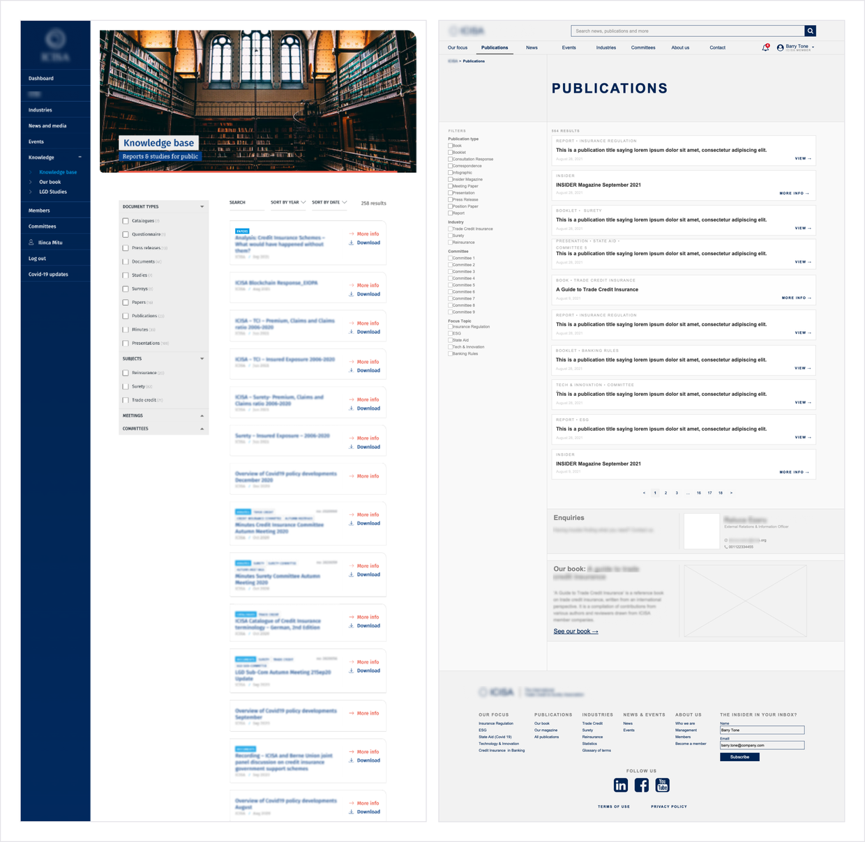
With all stakeholders fighting for homepage real estate, I drafted two options which were later used for usability testing.
The first option focused on providing context about the organisation and bringing attention to the search function, while the second prioritised the organisation's activity by highlighting news and social media posts. Business stakeholders were pushing for a news carousel on the homepage, which I wasn't very happy about . Instead of completely disregarding their request, I found a compromise solution by adding thumbnails on the sides of the carousel, enabling users to easily navigate between posts.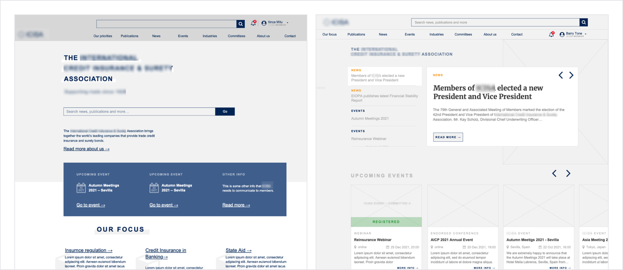
Insights from analytics influenced the design of some pages, such as the article singles or homepage.
For example, I noticed that people rarely used the dashboard page, which only displayed eventx they had registered for. Since events didn't happen very frequently, the dashboard was empty most of the time. To address this, removed the dashboard all-together and added “my registered events” on the homepage (if the user had any).
Also from analytics I discovered that many sessions began on an article page via a link (often from social media), with users reading the article and then leaving the site. To improve engagement, I added a "read more" section at the end of articles, displaying other articles with similar topics.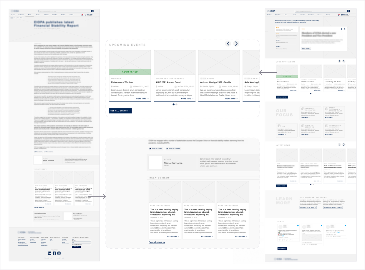
Technical constraints and trade offs
Working with Wordpress meant that we were constraint to whatever plugins were available.
Improving the search functionality was the biggest technical challenge. Because of the large number of documents on the website, we aimed for a performant search functionality, that could also search inside documents. As we were unable to implement this functionality, I decided to add more detailed tags and filters instead, even if it meant more work for the organization when publishing content.
I also handled other smaller constraints, such as incorporating social media posts on the homepage. For this, I had to adapt to the available plugins in terms of functionality and interactions.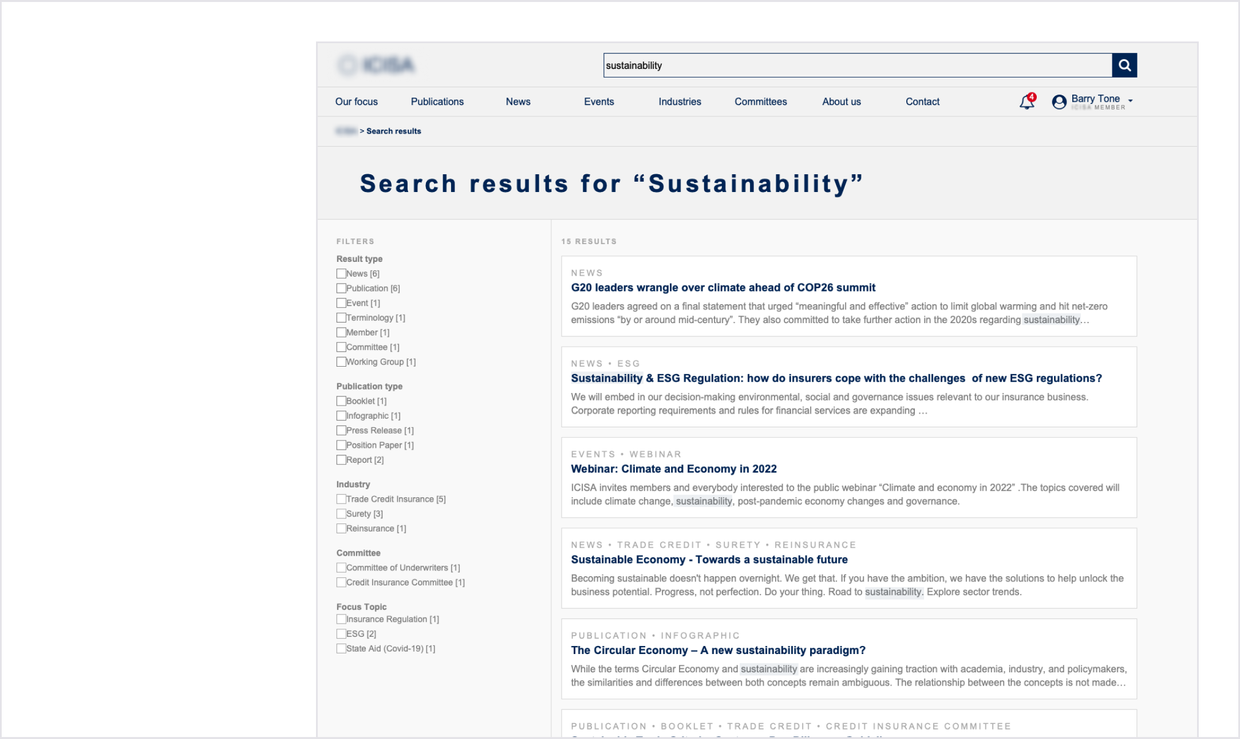
Usability testing
I did two rounds of usability testing, each with one member and one non-member user. Using the most important user flows as tasks, I put together test scripts and prepared Axure clickable prototypes
The first round was tested with the double nested navigation, and the second with the megamenu. We tested the same flows in each round. The flows were decided together with the organization stakeholders, considering user's main goals on the website: flow, flow, flow, flow. Each usability test also had an exploratory task, in which I asked participants to take a homepage tour and speak aloud.
Usability testing helped decide navigation and homepage design, and completely invalidated an assumption I had.
In terms of navigation, I found that members performed well with both dropdown and megamenu navigations, but the megamenu performed better for non-members. This is because it allowed for explanatory text to be added to each navigation item, making it clearer for them where to go.
During the two rounds of testing homepage designs, members were more excited about the one with the news carousel. I was so intrigued to hear the positive comments they had on the carousel, because prior to testing I was convinced that it would perform poorly:
“What I liked most about the homepage was the top section; the header is nice and the menu on there is interactive so it's easy to find what I am looking for via that route”
However, on the same version of the homepage, non-members were confused, because they were presented with the news carousel first, but expected some information about the organization. Ultimately, we used the second design but added the introductory text from the first to address this issue, and deprioritized the “Social” section.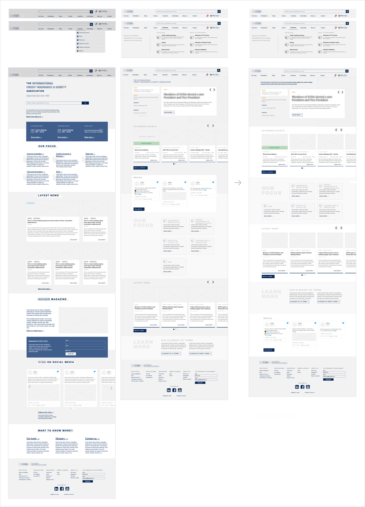
Testing user flows revealed some issues, such as having trouble finding buttons, as well as some nice to have's.
Non-members had a task to request an account and had problems finding the sign up form (under log in). They recommended that we added separate log in and sign up buttons. However, the business stakeholders decided not to go with this change, since they want to prevent uninvited people requesting credentials.
During testing, a participant had difficulty finding the "Register" button for an event. To address this, I improved the layout to make actions more visible. During testing, participants also revealed some other recommendations, such as adding a feature that allows them to add an event they registered for to their calendar. They also recommended implementing default arrival and departure dates based on the event dates. We accounted for these recommendations during implementation.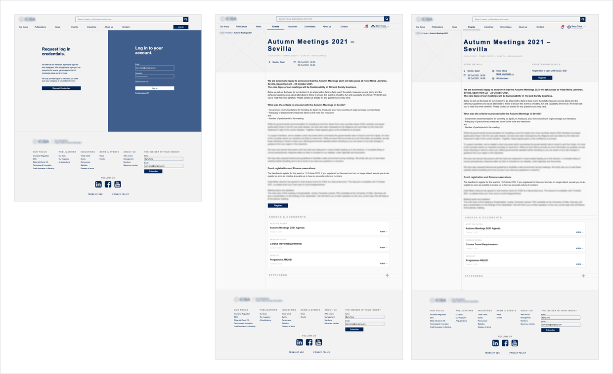
Detailing and handoff
After integrating the design changes, I handed off to UI and development complete wireframes for both desktop and mobile, as well as user flow and information architecture diagrams. These helped streamline the team's workflow and save time.
The developers were very happy about the detailed IA diagram I provided, because it helped them quickly understand page structure and navigation between pages. The UI designer appreciated the very detailed and clean wireframes I provided (in which I also included some reusable components).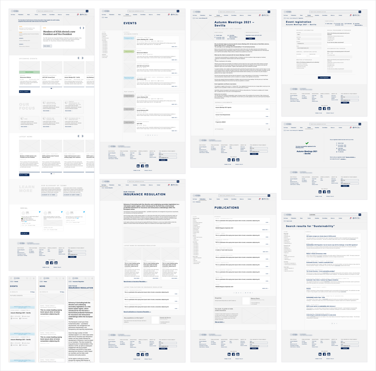
Review and monitoring
I kept collaborating closely with the team during implementation and monitored what happened after.
During implementation, I collaborated closely with the development team, QA and UI designer to uncover potential flaws. After implementation, I used Hotjar to monitor performance.
Implementation and review
Together with out UI designer, I reviewed the implementation for potential bugs and design inconsistencies.
This review built upon the testing done by the QA tester, focusing more on visual and interaction-related issues.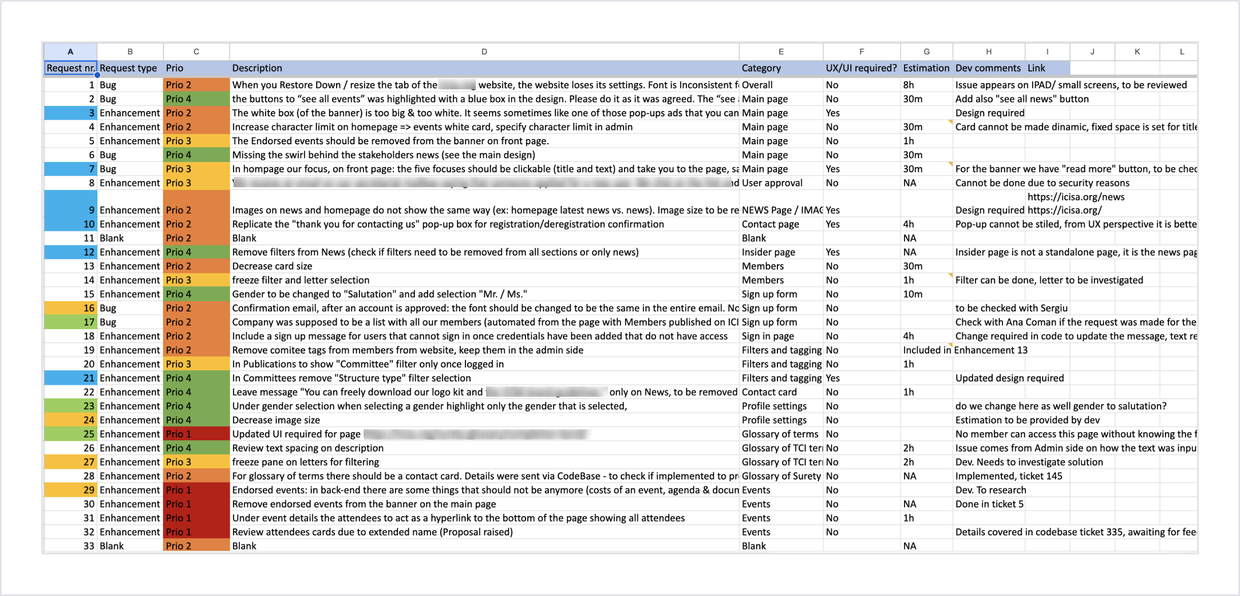
Monitoring and changes
We used Hotjar to monitor the performance of the website for a month after launch and checked customer support again. We ended up doing small improvements and bug fixes.
For example, from Hotjar we discovered that for many users clicking on the logo to go home was unclear, so we added “ home” as a specific item in the navigation bar.
Checking customer support, we noticed that quite a few people were still contacting the organisation to ask for insurance services (which they didn't provide themselves). I redesigned the contact form to make it more clear that, for such services, people should contact one of the organisation's members.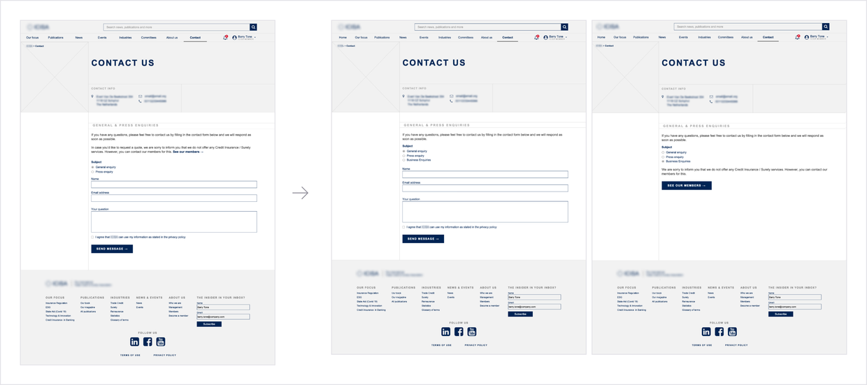
Outcomes and learnings
Six months later, customer support requests were down by 65%
The most notable decreases were in account reactivation requests and events-related request. The improved user flows contributed significantly to enhance member's experience with the organisation and the website.
Compared to the last six months before redesign, the number of sessions on the site tripled.
The "Publications” and "News” pages, which were the organisation's main points of communication to its members and the press, had a 35% increase in views.
The organization's stakeholders were very satisfied with the results we achieved, and so were we.
The most important learning I had throughout this project was that it's essential to address even the smallest issues or pain points. The changes I made weren't huge, but they brought significant improvements in the overall user experience.
